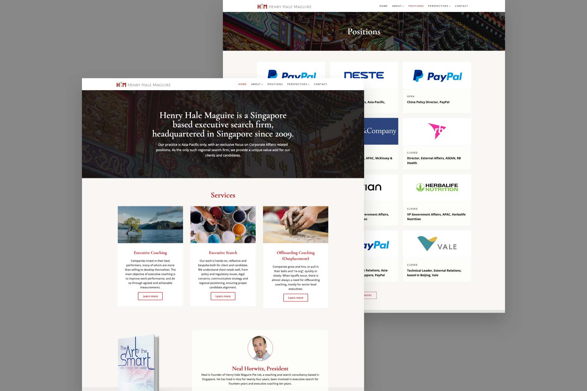
Henry Hale Maguire’s website was first built in 2011, and it was time for a redesign in 2016. Their previous logo also looked outdated and was not an accurate representation of the high quality services that the company provides.
We updated their website with a fresh new look that is vibrant and uplifting. It features a mobile-adaptive design that passes Google’s mobile test.
The tagline of Henry Hale Maguire is ‘Advancing Asian Talent’.
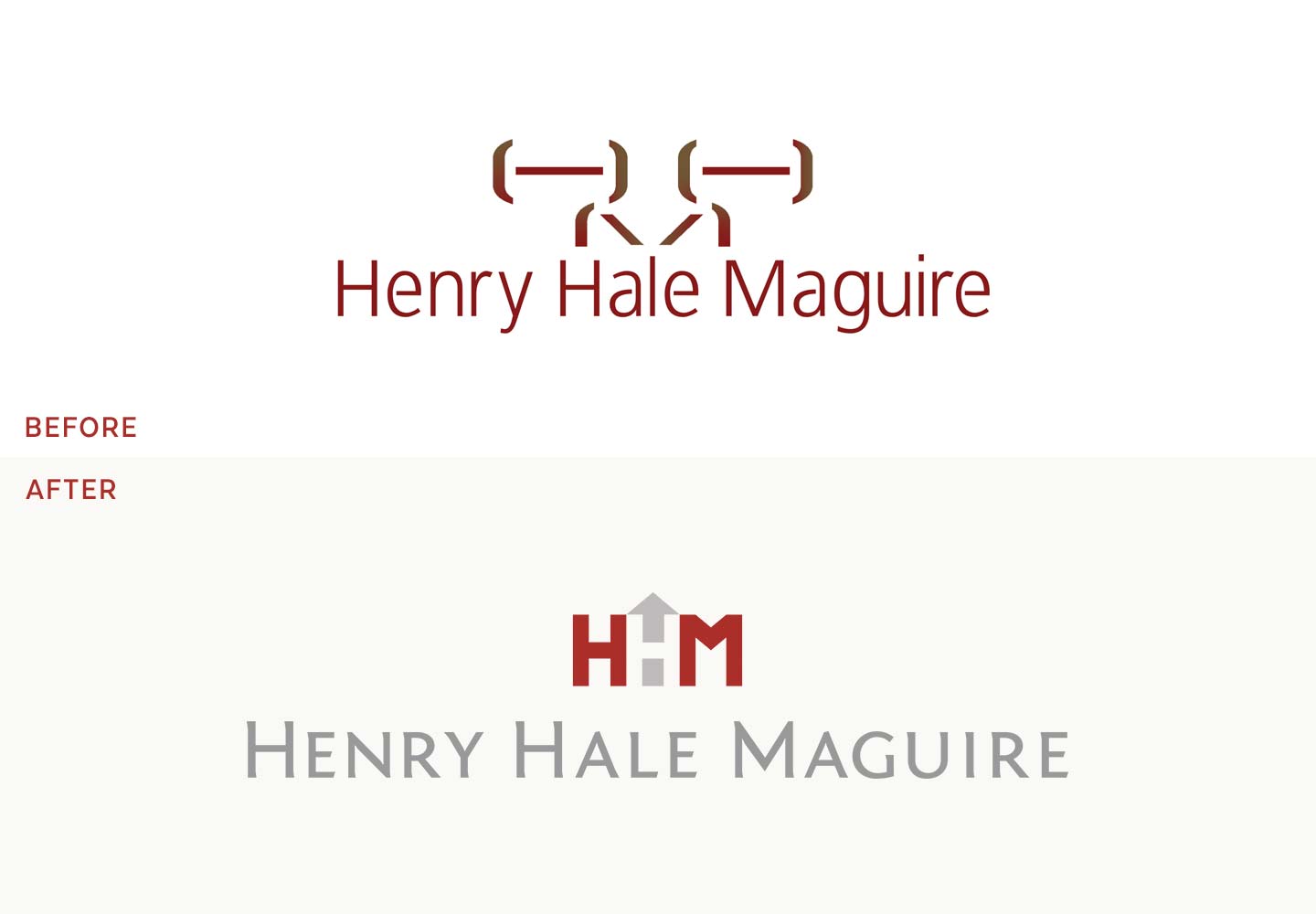
The logo mark itself is made of the letters “H” and “M” and an arrow. The arrow pointing up stands for advancement, or moving up.
The second “H” is formed in the negative space between the first “H”, the “M”, and the arrow, and may not be obvious at first glance. The hidden “H” represents how Henry Hale Maguire uncovers hidden talent.
Grey and Red were chosen as the brand colours.
The professionalism of grey is supported by the passion of red. Red is also a symbol of good luck in many Asian countries, where Henry Hale Maguire operates.
Light cream was added to the colour palette as a complement to the strong red colour.
![]()