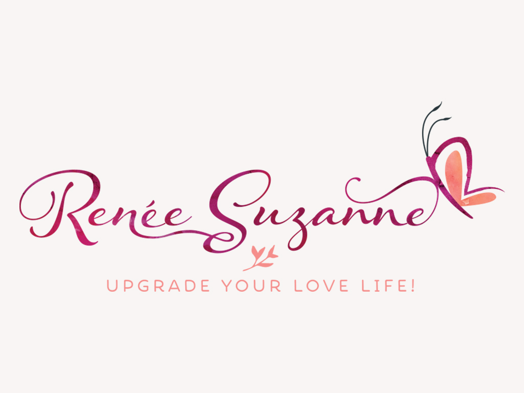
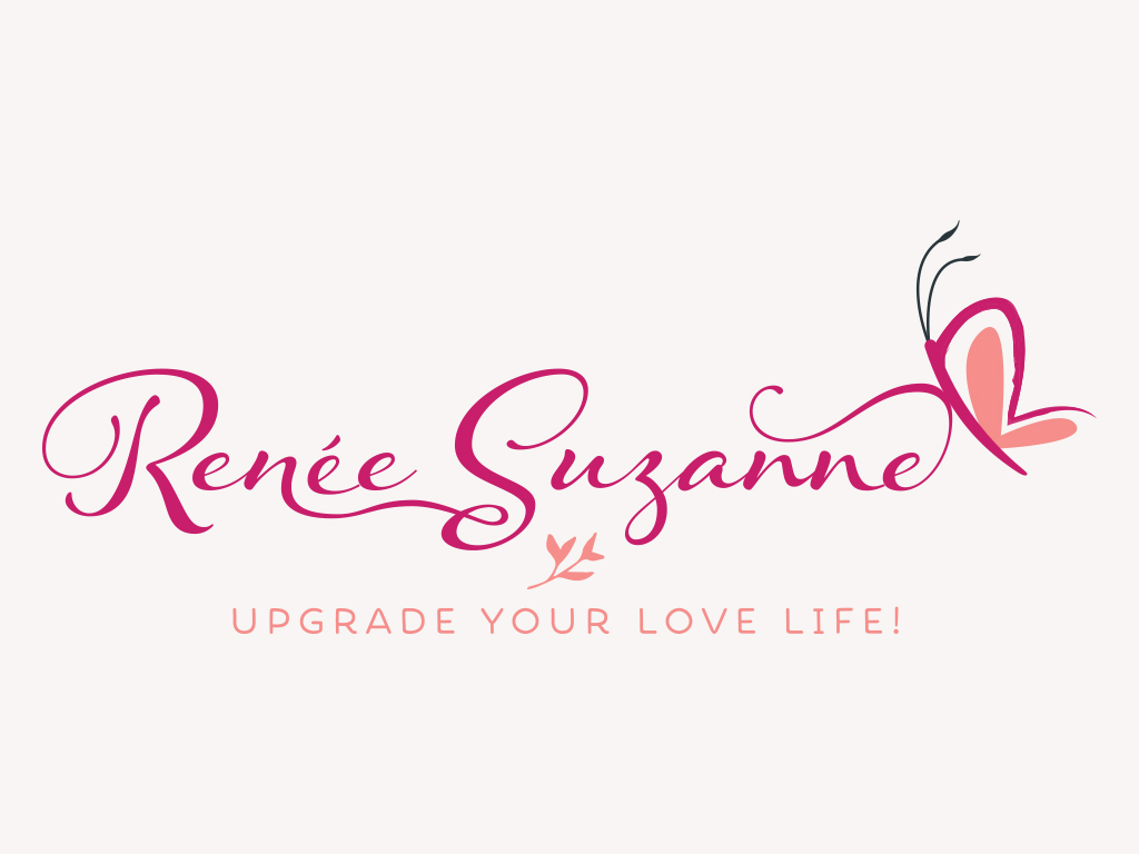
A handwritten script font was chosen to form Renée Suzanne to give the logo a personal touch, and it can also double up as Renée’s digital signature where it can be used at the bottom of blog posts or email newsletters, etc.
The letter ‘R’ forms the wings of a butterfly, and the tail of the last letter ‘e’ has been curved to form a branch in the shape of the letter ‘S’. The butterfly stands for the transformation that Renée helps her clients to achieve through her coaching, and it also represents beauty and the femininity. A heart shape lies in the wings of the butterfly, to represent the work that Renée does.
For Renée’s website, I adapted and customised a WordPress theme, as well as added Paypal buttons to her products.
I designed the cover photos for her social media sites, Facebook, Twitter, YouTube and MeetUp.
I also helped Renée to design her business cards, as well as postcards and flyers for marketing purposes.

A watercolour treatment has been applied to the logo for use on the web, to represent the creative and unique work that Renée does. She can also include product names or sub-brands under her logo.

Solid colour logo for print or low res usage
![]()
![]()
![]()
![]()
![]()