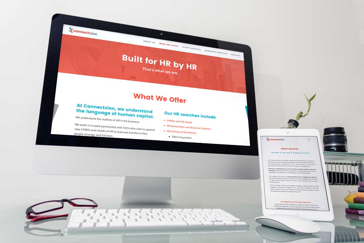
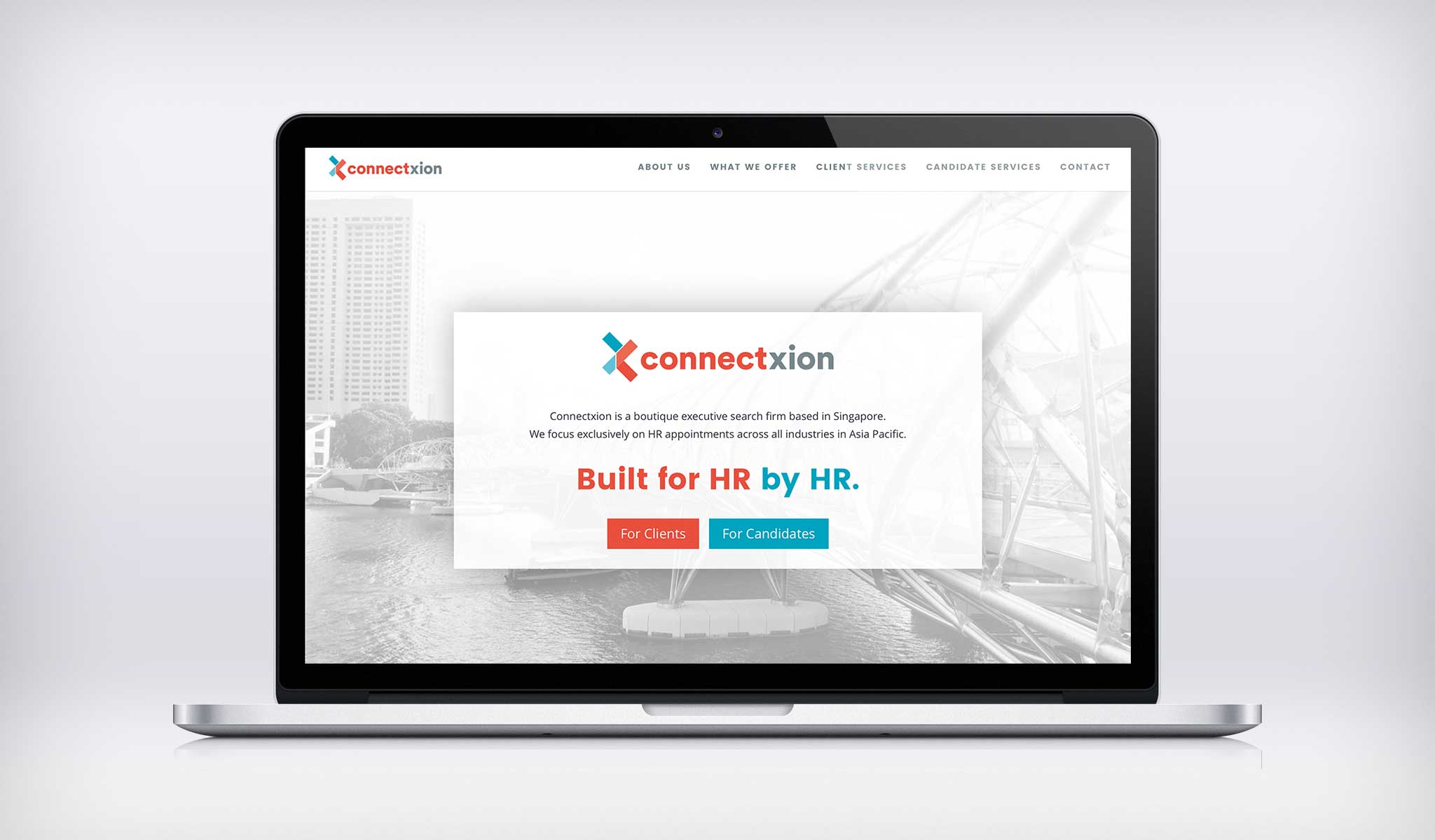
Connectxion is a new company that needed a logo and online presence. Jeanette wanted to stand out amongst all the other executive search firms with a bold, fresh and vibrant logo, visual language and website.
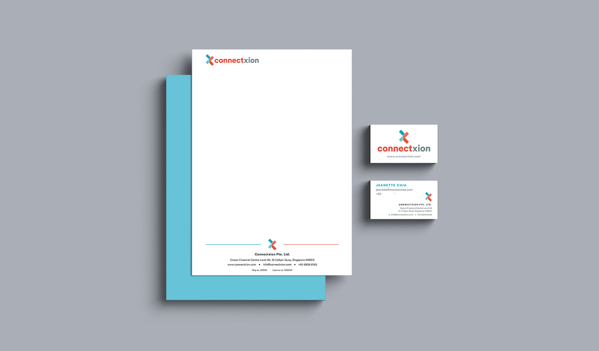
I helped Connectxion to design a logo that is strong and decided on a vibrant and bold colour palette that is not very common within the executive search industry.
The logo is made up of two “T”s that are arranged to form a “X”. It folds and fits together, expanding on the “jigsaw” concept. The wordmark is set in all lowercase to portray friendliness.
A hidden arrow between “t” and “x”, similar to the FedEx hidden arrow, symbolises that Connectxion is always moving forward.
![]()