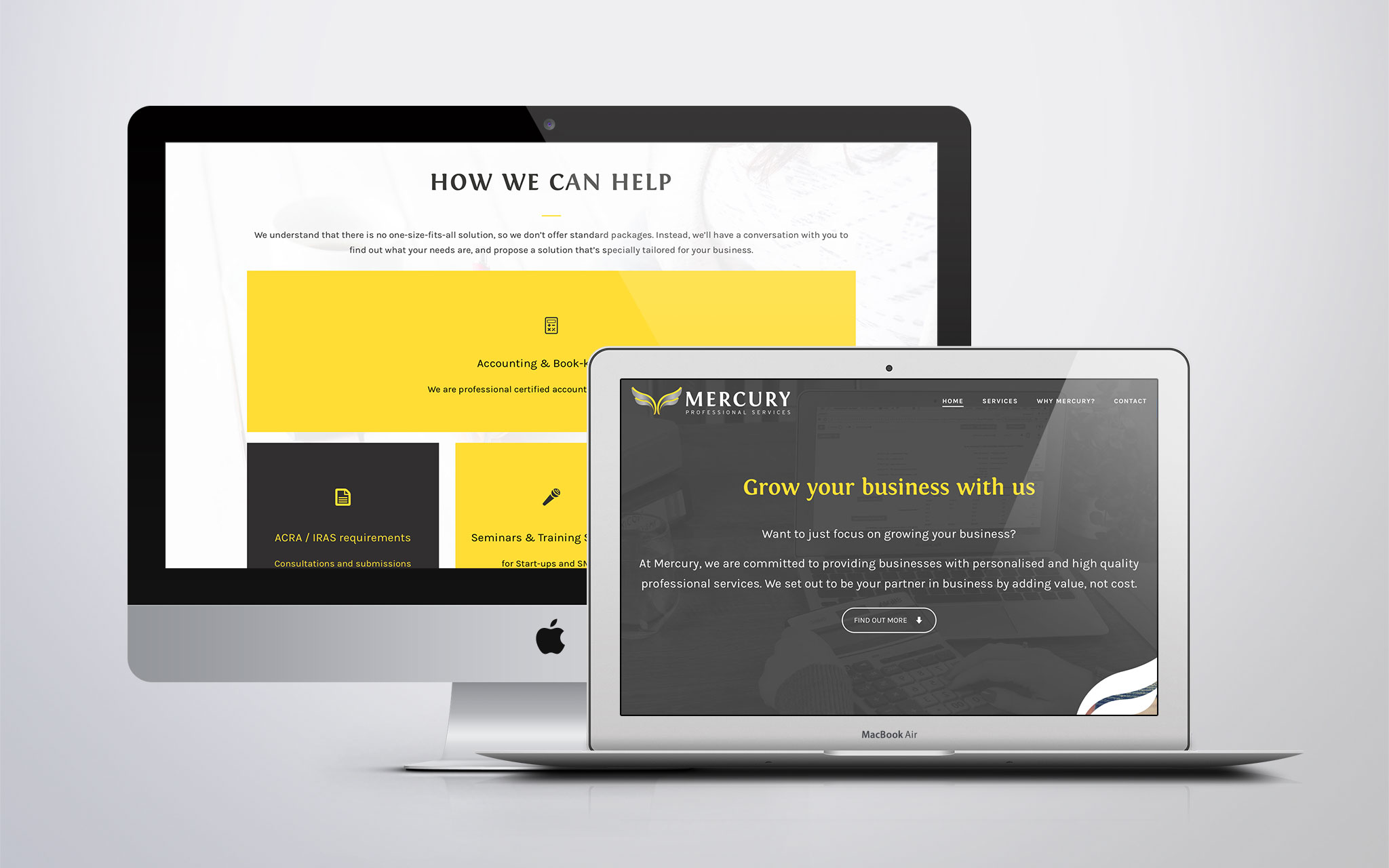
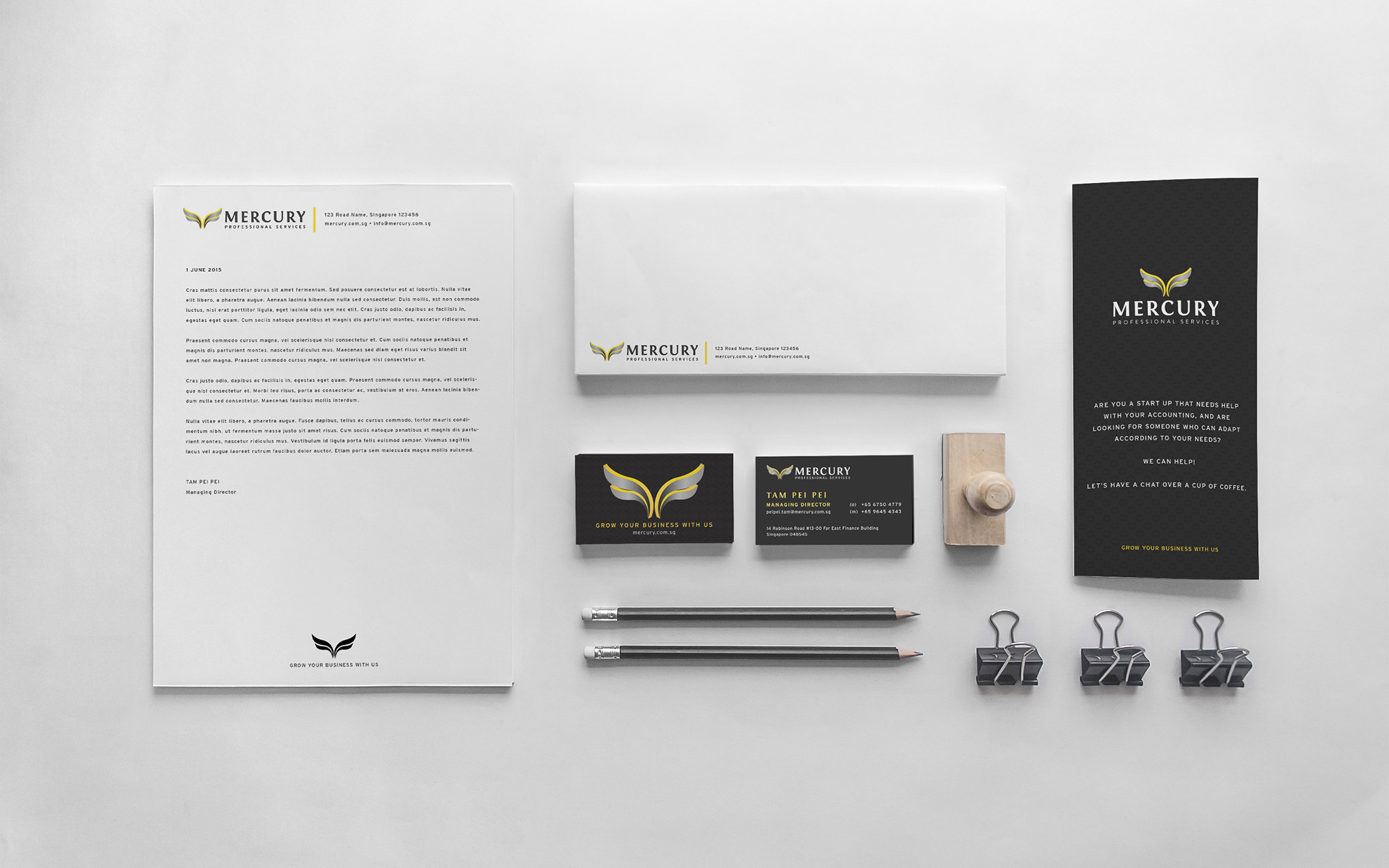
Mercury Professional Services approached me to help design the logo, brand identity and website for MPS. Unlike many other service providers, MPS provides personalised corporate accounting services and does not sell standard packages.
Mercury was chosen as the business name to symbolise how the company grows and flows with their clients, and adapts to their needs.
For the website, she wanted a simple one-page website to showcase Mercury’s services and talk about their USP.
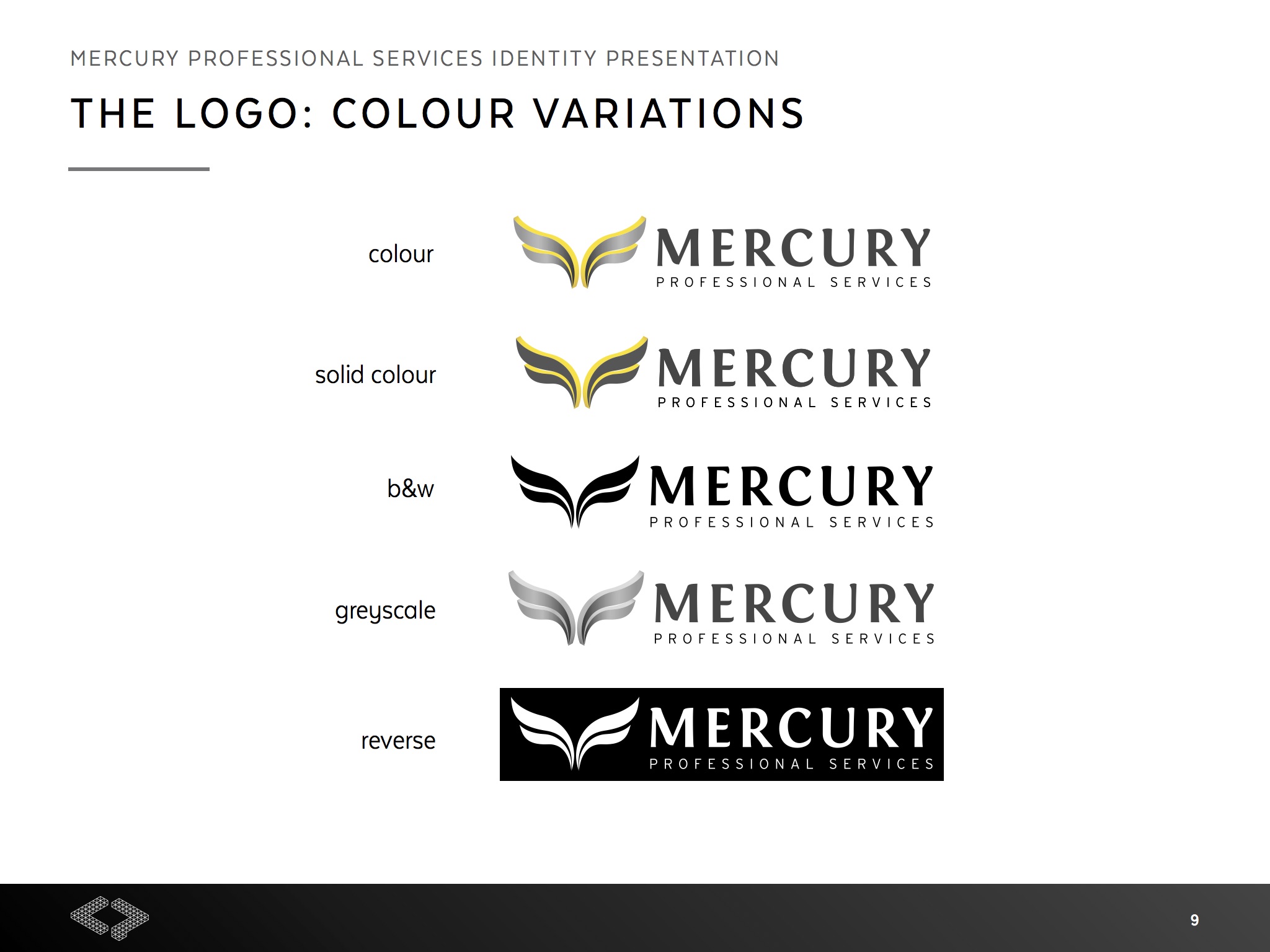
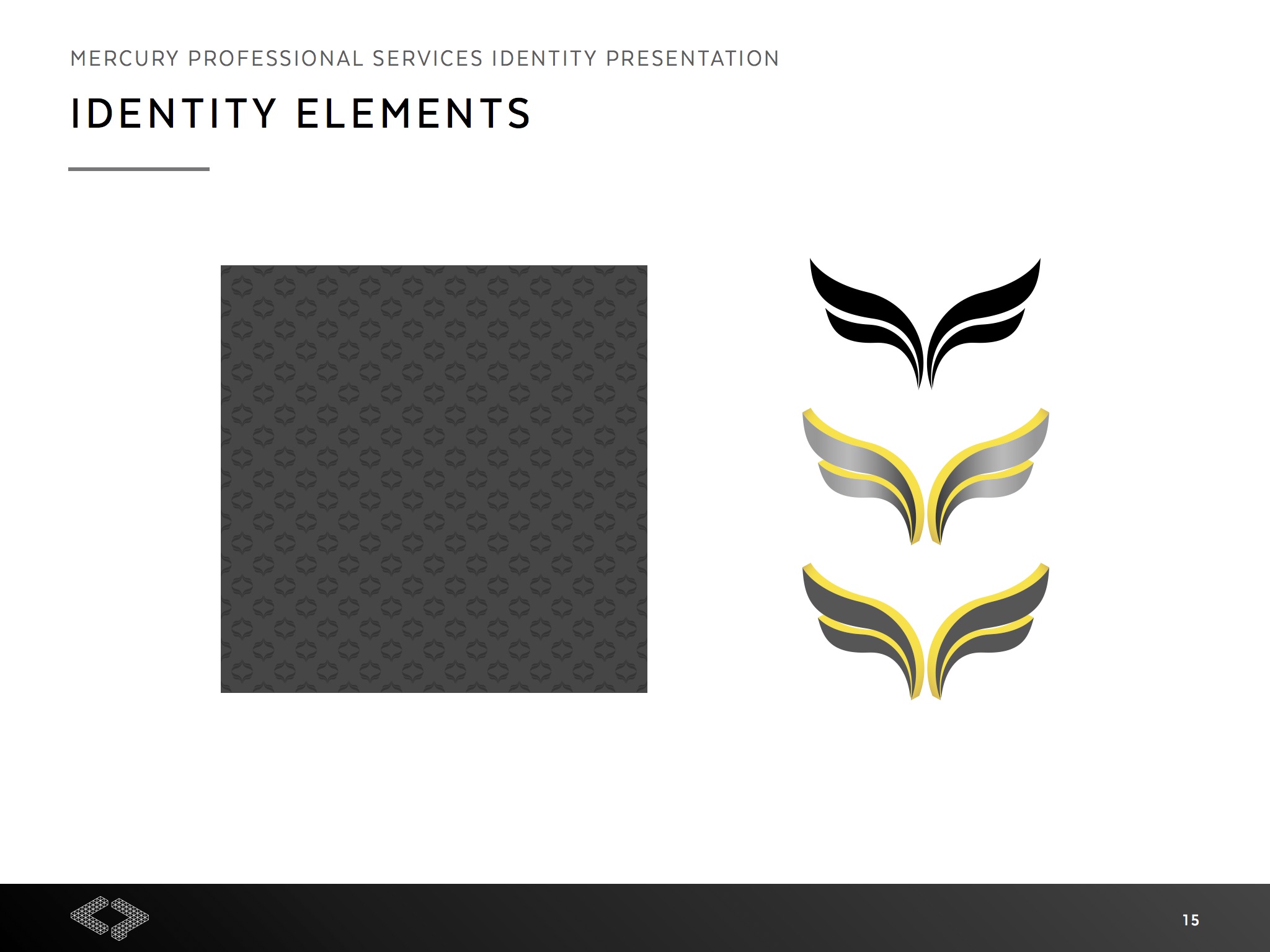
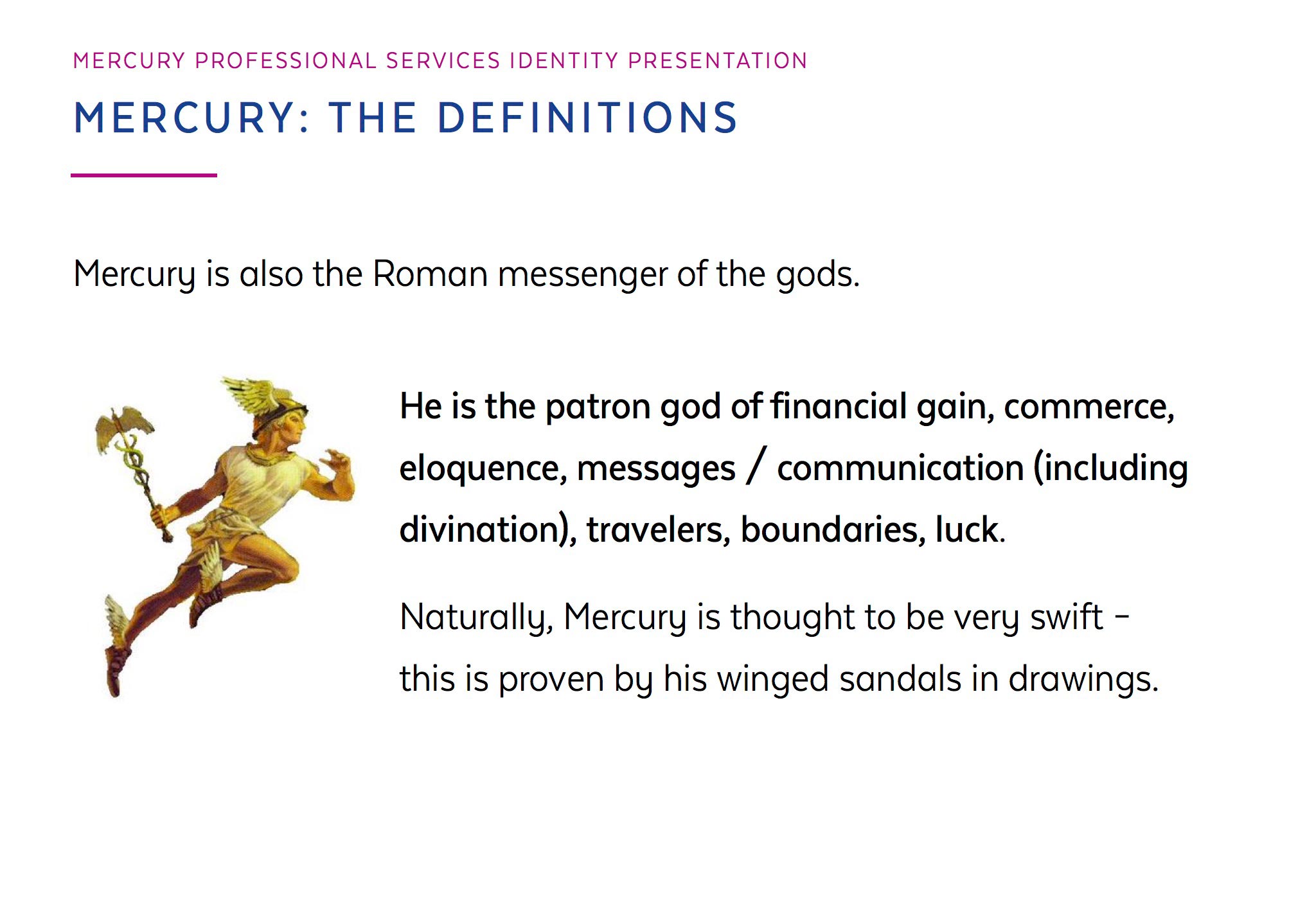
The logo is based on the wings of the Roman messenger of gods Mercury. The wings, which look like they are filled with the liquid mercury, are also shaped like leaves, which symbolise growth (referring to the tagline, Grow your business with us).
The logo can also be seen as two palms facing up, symbolising the support and value that MPS provides to its clients, in turn helping its clients to grow their business.
The vertical lockup of the logo was done so that the “C” looks like it has wings on its head.
![]()
Yellow, grey and black were chosen for the colour palette.
Grey and black are more serious and professional colours, with black symbolising wealth and prestige.
Yellow is a personable, friendly and uplifting colour, and it represents the mutually supportive relationship that MPS shares with its clients. It is the perfect complement to the darker shades in the logo, and adds vibrancy to the overall feel.